
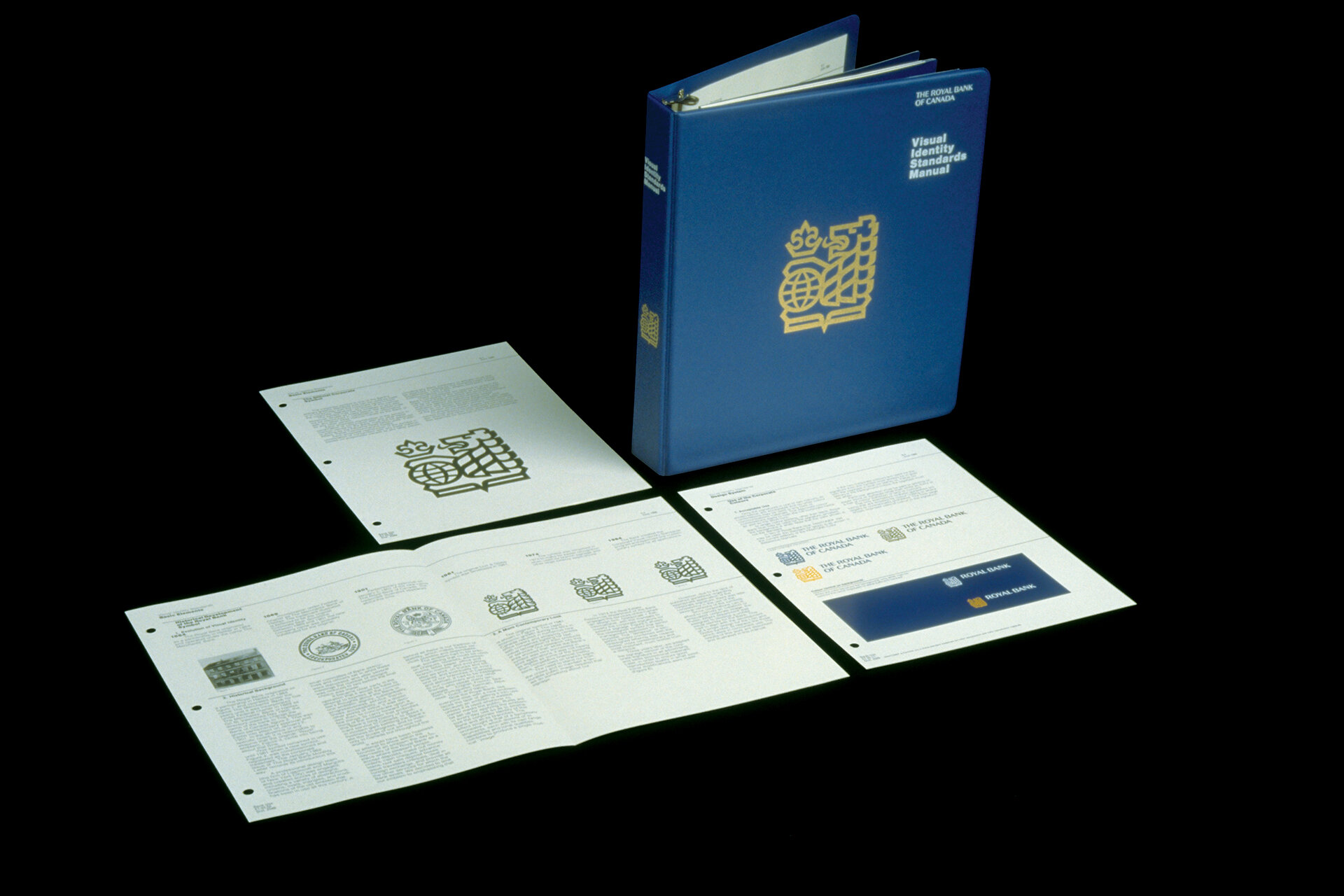

Gottschalk+Ash was asked to redesign the identity of the Royal Bank of Canada, the country’s largest financial institution. Its last logo had been created by Lippincott & Margulies in 1962.
The bank’s name was shortened to “Royal Bank,” to make it easier to use in signage and other applications. Using the existing heraldry, Gottschalk+Ash stylized the lion symbol to make it bolder in architectural signage applications. They also further stylized the lettering and created a graphic standards manual controlling the use of the identity in all applications.