


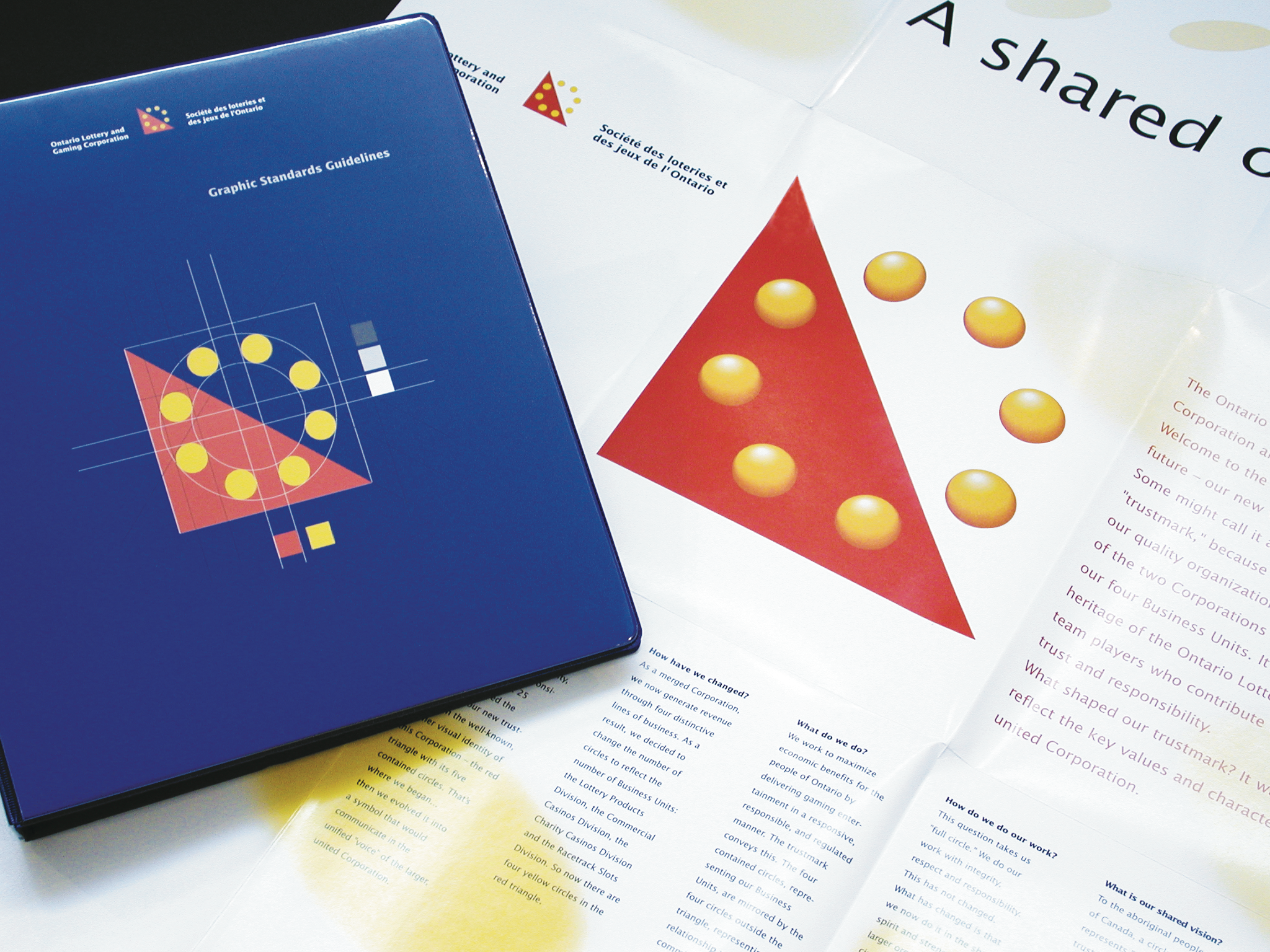

To create a visual identity for the gaming giant Ontario Lottery Corporation, Gottschalk+Ash did a comprehensive visual audit of the different kinds of retail outlets selling lottery tickets, yielding a total point-of-purchasing marketing program that consolidated the different lottery games under one identifier.
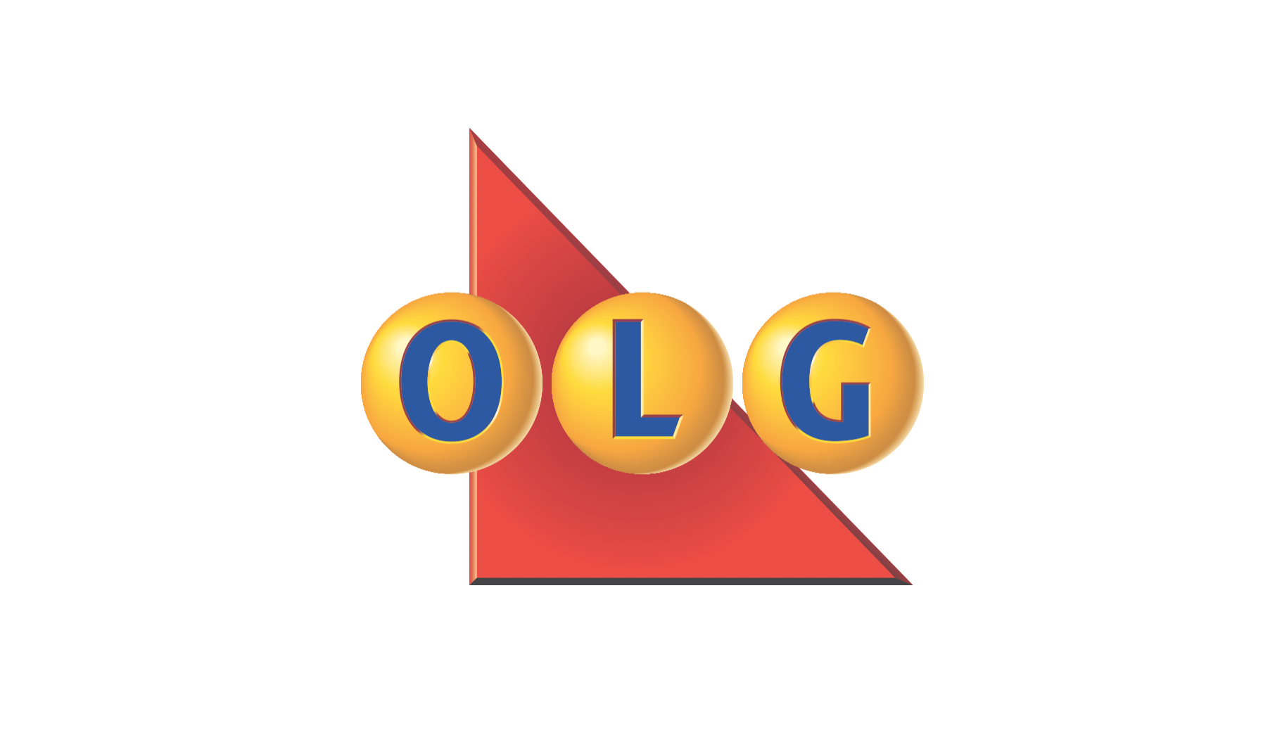
The logo the team created featured a red triangle with a series of gold dots — like coins — spelling out a capital L. The bright colours and bold shapes gave the logo strong street presence — important since lottery tickets would be sold at thousands of locations all over the province.
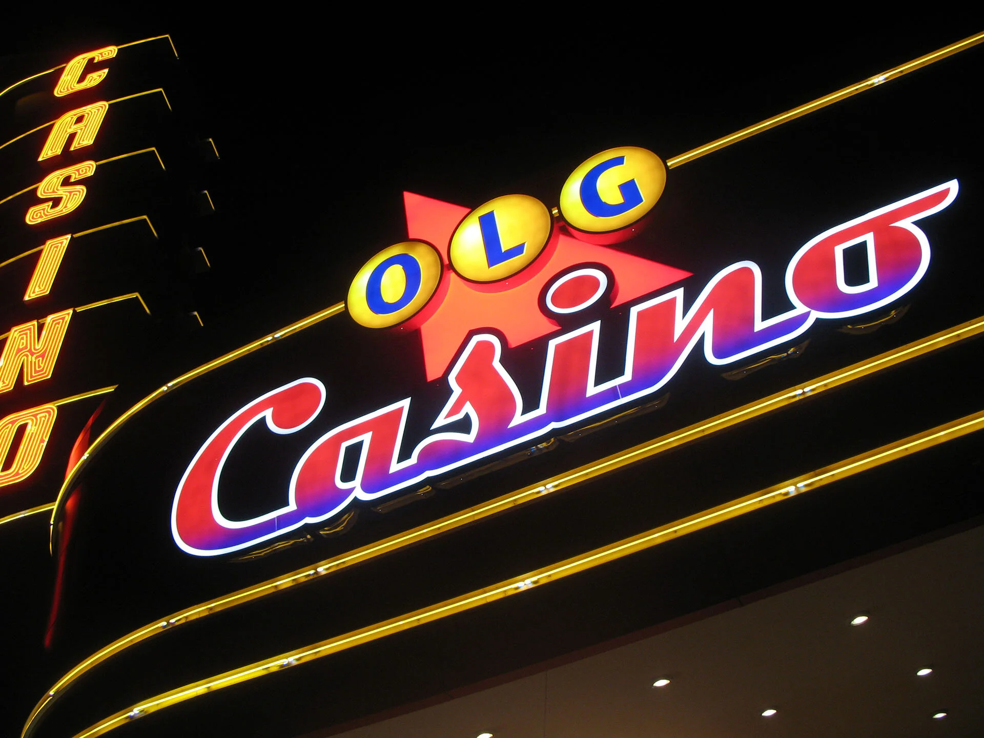
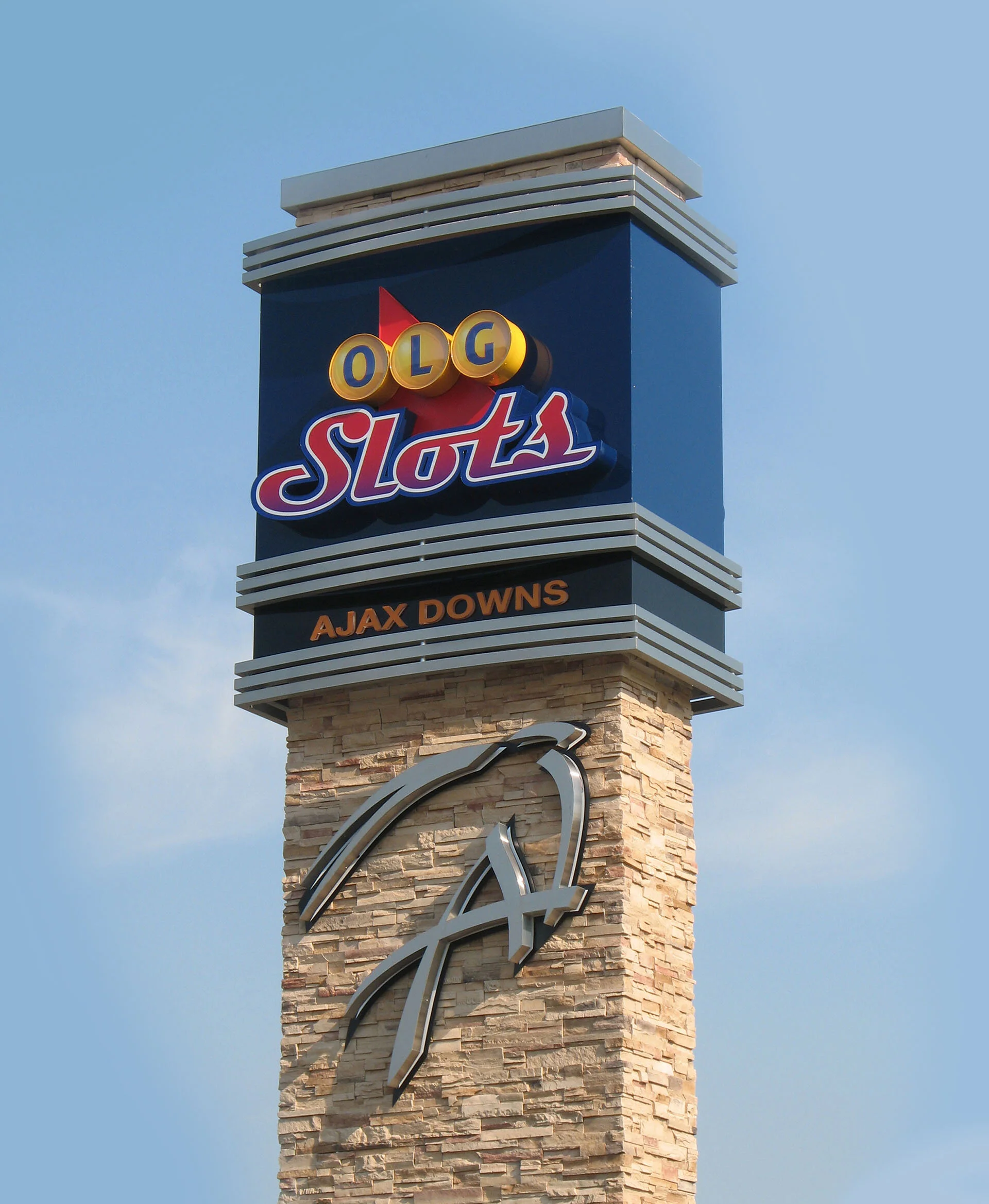
The logo, often paired with a blue background and Lotto Centre identifier, became the basis for modular displays that decorated the counters, windows and doors of corner stores throughout Ontario. The L-shaped form was also easily adapted to 3D ticket holders, complementing and reinforcing the brand. In later years OLG came to Gottschalk+Ash for evolutions of the logo.